The Davis Beat
Alternative newspaper on the UC Davis campus, focusing on campus issues and investigative journalism.
2012—2015

Context
Role: Layout Editor
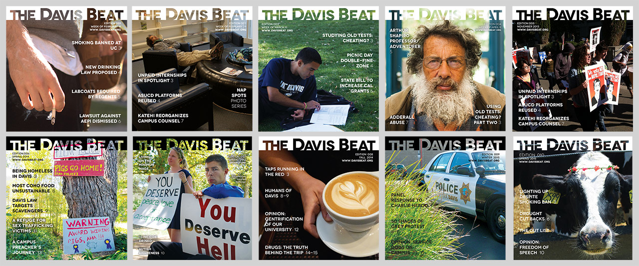
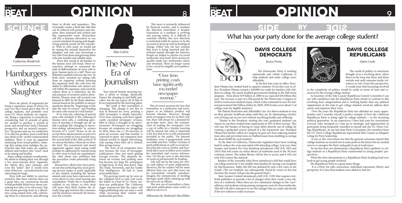
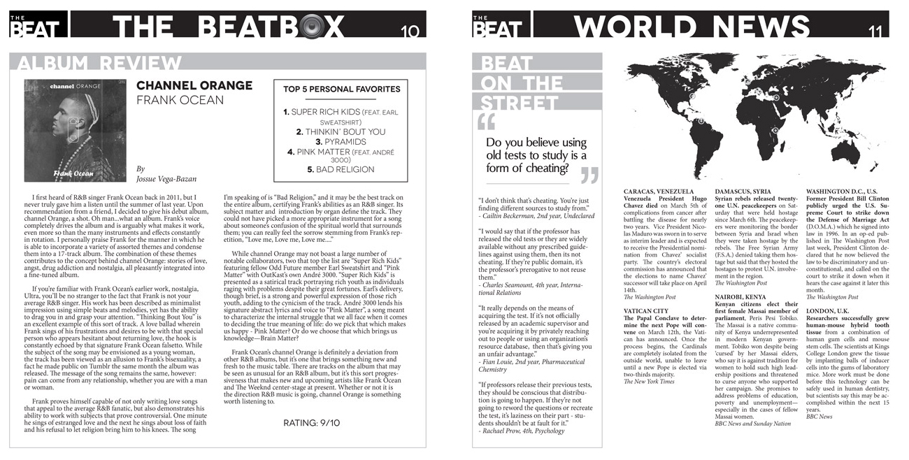
I worked with a team of undergrad students with the aim of providing the campus with an alternative, investigative-centered newspaper. I designed the brand identity and later a total of 10 editions throughout the three years as Layout Editor. I was provided all content (copy and images), which I fit into a flexible layout, but was still required to custom-fit all content, since articles and images were variable lengths and sizes.
I also worked with professional printing press regarding print specifications (The Enterprise newspaper in Davis, Ca.).
Created with Adobe Photoshop and InDesign.

Branding
Logo
.jpg)
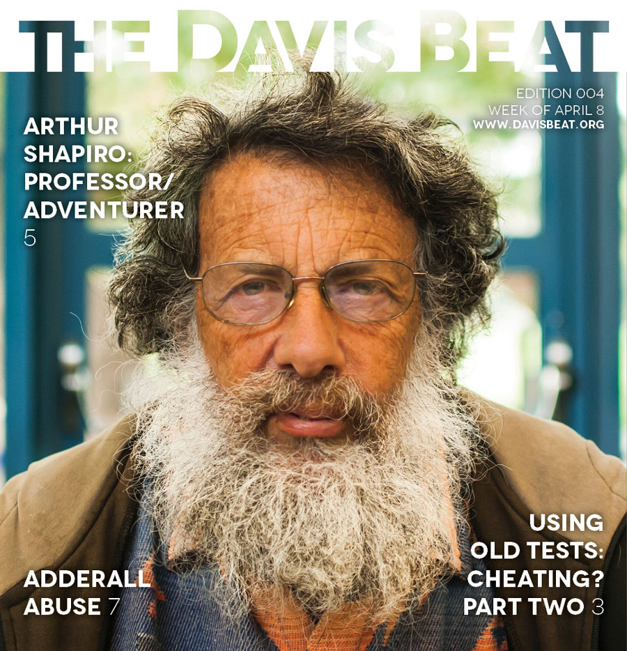
The goal of the newspaper was to provide more investigative journalism to the campus and the logo encompasses this through its transparenct effect on the front cover (as seen above).
The logo was designed in black & white since newspapers are—duh—mostly printed so. Furthermore, the B&W aspect to the logo provided the flexibility to invert it depending on the cover photo's darkness/lightness.

.jpg)
.jpg)
Typography & Color Palette

Layout


Concluding Thoughts
It was pretty interesting designing a printed newspaper during a time of digital migration for newspapers and magazines in general. We certainly had/have a web presence, but the founders stuck mainly to print, due its authenticity. We actually got featured in a Sacramento newspaper (yes, digitally) about our decision to pursue print. I learned a lot about deadlines, print design, and the bulk printing process itself, but most important of all, I met some great people.